
The start of a new school year is one of the busiest — and most important — seasons for any campus. Families are forming first impressions. Students are arriving with fresh eyes. Staff are setting the tone for the months ahead.
And in the middle of all that, design is doing quiet but powerful work.
The schools that look organized, cohesive, and professional don't just seem better — they build the kind of community pride and parent confidence that takes years to develop through reputation alone. The good news? A lot of that visual impact comes down to five key design assets that every school should have ready before the first bell rings.

1. School Spirit Merchandise
Few things unify a school community faster than everyone wearing the same colors.
A well-designed t-shirt, hoodie, or cap isn't just apparel — it's a walking advertisement for your school culture. When students wear your gear with pride, it tells the world (and prospective families) that this is a place people want to belong to.
But design matters here more than most administrators realize. A logo slapped onto a Gildan blank is not the same as a purposefully designed piece of merch. The best school spirit merchandise is designed with the garment in mind — the placement, the color contrast against the fabric, the way the art scales. When it's done right, students actually want to wear it. When it's not, it ends up at the bottom of a drawer.
Before the year starts, consider: a student t-shirt for the first week, staff polos for faculty visibility, and a banner or two for your front office and gymnasium. These small investments create an immediate sense of belonging that sets the tone for everything that follows.

2. Event Flyers and Enrollment Materials
Whether you're hosting an open house, a back-to-school night, a fundraiser, or a community event, your flyer is the first thing families see — and it needs to work hard.
A well-designed flyer communicates more than event details. It signals that your school is organized and professional, and that you respect the time and attention of your community. A cluttered, hard-to-read flyer with mismatched fonts and low-resolution images sends the opposite message, even unintentionally.
The same principle applies to enrollment materials — brochures, one-pagers, and packets that prospective families take home. These are sales tools, even if we don't like calling them that. They need to be visually compelling, easy to navigate, and consistent with the rest of your school's visual identity. A family choosing between two schools will notice the difference between a polished brochure and a photocopied sheet — and they'll draw conclusions from it.

3. Social Media Templates for Announcements
Your school's social media presence is often the first place parents check for updates, closures, event reminders, and celebrations. And if every post looks different — different fonts, different colors, photos at random sizes — it creates visual noise that quietly erodes trust.
A set of branded social media templates solves this problem entirely.
Think of them as pre-built frames your office staff can drop content into without needing any design skills. One template for announcements, one for event promotions, one for student spotlights, one for reminders. Each one uses your school's colors and fonts, so every post reinforces your visual identity rather than diluting it.
The result: a feed that looks intentional, professional, and consistent — week after week, all year long — without requiring your staff to reinvent the wheel every time they have something to share.

4. Wayfinding Signage and Campus Branding
Walk onto a well-designed campus and you feel it immediately. The signage is clear. The colors are consistent. The school's identity shows up on the entrance, in the hallways, above the gym bleachers. It feels like a place that takes itself seriously.
Wayfinding signage — directional signs, room labels, building identifiers — serves a practical function for visitors, substitutes, and new students. But it also does something more subtle: it tells everyone on campus that this place has been thought about. That someone cares about the experience of being here.
Before the year starts, it's worth auditing what your campus looks like to a first-time visitor. Is it easy to find the main office? Does your school's name and visual identity show up prominently at the entrance? Do your hallways communicate school values, achievements, or pride? If the answer to any of these is "not really," that's an opportunity.
5. Bilingual Design for Diverse School Communities
If your school serves families whose primary language is Spanish — as many schools across Los Angeles and Southern California do — your design materials need to speak to them directly. Not as an afterthought, but as a first-class consideration.
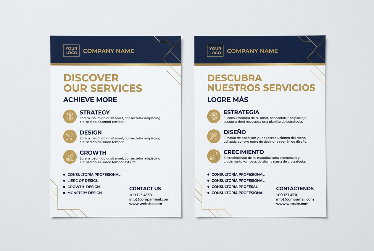
This goes beyond translation. Effective bilingual design means the Spanish version of your flyer reads just as naturally as the English one, with proper typographic treatment and enough space for the text to breathe. It means your enrollment brochure doesn't feel like a photocopy of the English original with Google-translated text squeezed in.
When Spanish-speaking families receive materials that were clearly designed for them — not just adapted for them — it communicates something important: this school sees our community. That kind of inclusive design builds loyalty and trust in ways that are hard to manufacture any other way.
At Aguilar Design Co., bilingual design is something we bring to every school project as a matter of course — not as an add-on. It's part of how we serve the communities we work in.
Why Consistency Across All of These Matters
You may have noticed a thread running through each of these five areas: consistency.
The schools that build the strongest visual identity aren't necessarily the ones with the biggest budget — they're the ones where the logo on the t-shirt matches the colors on the banner matches the fonts on the flyer matches the style of the social post. When everything looks like it belongs together, it communicates something powerful: this school has a clear sense of who it is.
That coherence doesn't happen by accident. It's the result of a defined visual identity — a set of design standards that every piece of communication follows. And it's one of the most valuable investments a school administrator can make before the year begins.

Let's Get Your Campus Ready
Whether you're a public school, a charter, or a private institution, Aguilar Design Co. works with schools across the Los Angeles area to create the visual materials that make campuses feel like communities.
We understand the tight timelines, the budget conversations, and the need for materials in both English and Spanish. And we do it all with the care and intentionality that your school community deserves.
Let's talk about what your school needs this year.
Aguilar Design Co. is a graphic design studio based in Los Angeles, CA. We design logos, brand identities, merchandise, event materials, and more for small businesses and schools throughout Southern California. Hablamos español.