7 Branding Mistakes Small Businesses Make (and How a Designer Fixes Them
The branding mistakes small businesses make most often are not expensive to fix. They are things like using five colors instead of three, never writing the brand's fonts and colors down, and treating a logo as a one-time purchase instead of an evolving system. Each mistake below is one a graphic designer can usually correct in a single project, often for less than the cost of a month's worth of flyers and social posts. Here are the seven we see most, why each one is quietly costing you sales, and the fix.
The 7 Mistakes at a Glance
MistakeQuick FixInconsistent colors and fontsPick 2 to 3 colors and 2 fonts, use them everywhereDIY clip-art logoCustom vector mark that scales cleanlyNo brand guidelinesA one-page brand cheat sheetDesigning for yourselfStart with a brand discovery conversationCopying a competitorUse research to find the gap, not the answerNo print-ready filesGet vector formats delivered up frontSet-it-and-forget-it brandingA light brand check-in every 2 to 3 years
1. Inconsistent Colors and Fonts Across Every Platform
This is the single most common mistake: the logo is teal, the website buttons are blue, the Instagram posts are orange, and the sign out front uses whatever font the sign shop had on hand. None of it looks related, and customers who see your truck, your storefront, and your Facebook page on the same day often do not realize they belong to the same business.
Businesses that present their brand consistently across every channel see meaningfully higher revenue than those that do not https://www.wearetenet.com/blog/branding-statistics Consistency is not a design preference. It is what lets people recognize you fast enough to trust you.
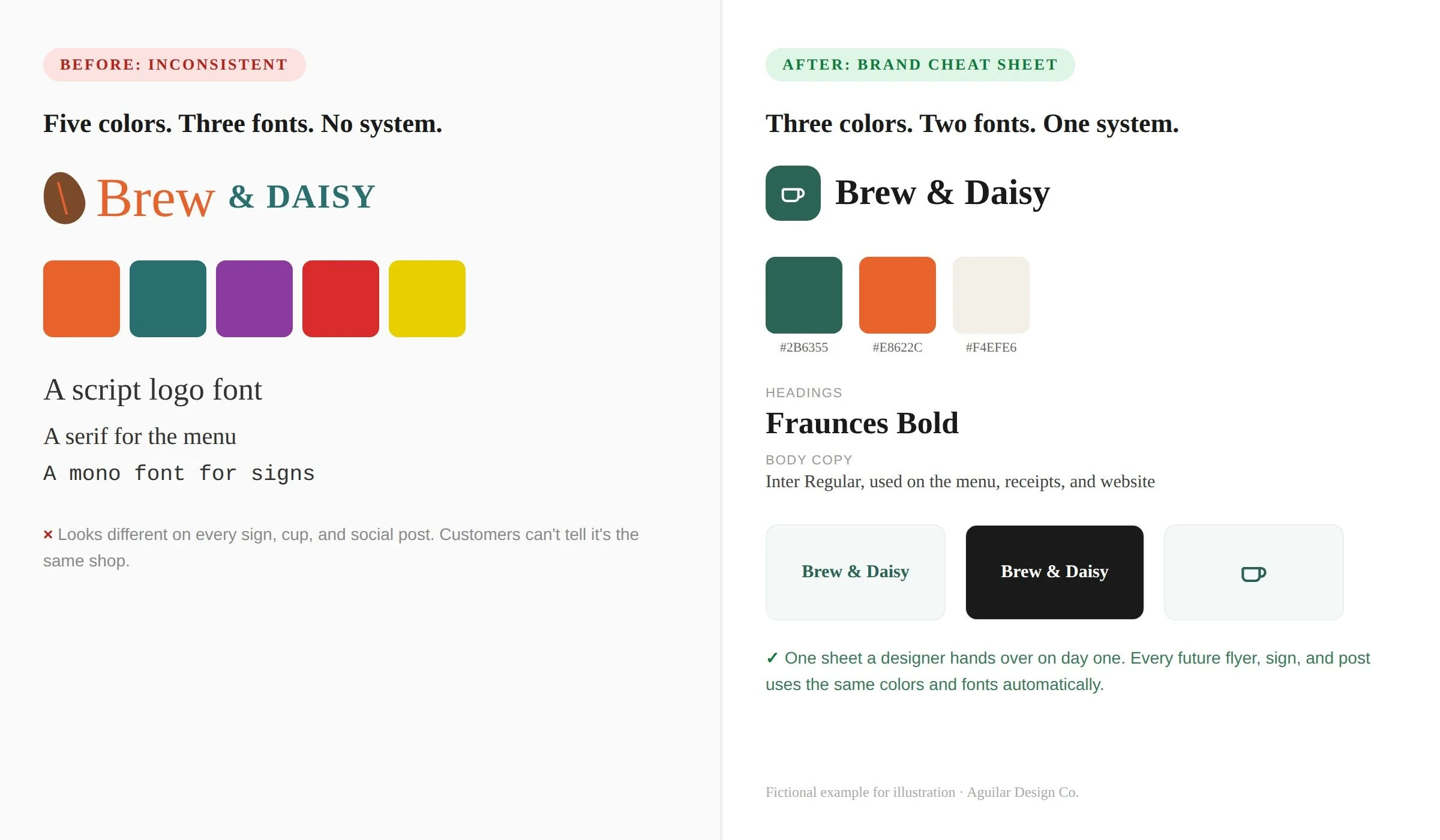
The fix: a designer picks two or three brand colors and two typefaces, one for headings and one for body copy, and applies them everywhere: the logo, the website, social templates, signage, packaging, and print. It takes one project to set up and then costs nothing to maintain.
2. A DIY Clip-Art Logo That Looks Like Everyone Else's
Free logo makers and clip-art templates are tempting, but they pull from the same limited library every other small business is also pulling from. The result looks close enough to a dozen competitors that it does not actually identify you. Worse, most of these tools only export a low-resolution PNG, which becomes a real problem the first time you need a large banner or an embroidered staff shirt.
The fix: a custom mark built around something specific to your business, in a vector format that scales from a favicon to a billboard without going blurry. It does not need to be complicated. Some of the most recognizable small business logos are just a well-chosen typeface and one simple shape.
Brand Identity & Logo Design
Featured Service
https://www.aguilardesignco.com/services/brand-identity Brand Identity & Logo Design
A custom logo, color palette, and font system built around your business, delivered as a one-page brand guide you can hand to any printer or freelancer.
Custom quote https://www.aguilardesignco.com/contact See the service
3. No Brand Guidelines Written Down Anywhere
Even businesses with a decent logo often have no record of the exact colors, fonts, or spacing rules that go with it. Every new flyer or vendor project then starts from a guess: one employee eyeballs a color from an old photo, the next downloads a font that looks close enough, and within a year the brand has quietly drifted into several slightly different versions of itself.
The fix: a one-page brand cheat sheet, like the example above, listing exact hex codes, the two approved fonts, and two or three logo variations (full color, single color, and icon only). It takes a designer an afternoon to build and it is the single cheapest way to protect consistency going forward.
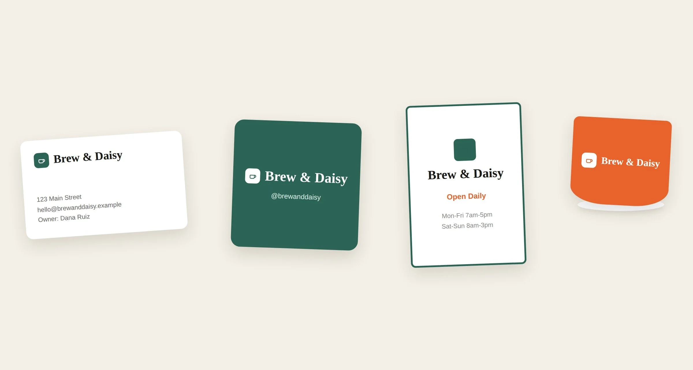
Consistent coffee shop branding applied across a business card, an Instagram profile tile, a sandwich board sign, and a cup sleeve" The payoff of a written brand system: the same colors, fonts, and logo lockup working across a business card, social profile, sign, and packaging, with no guesswork.
4. Designing for Yourself Instead of Your Actual Customer
It is natural to pick colors and a tone you personally like, but the business is being marketed to your customer, not to you. A daycare owner who loves a moody, minimalist look may be working against herself if parents respond better to warm, approachable design. A landscaping company chasing a sleek tech-startup look may seem out of place to homeowners who want to feel reassured, not impressed.
The fix: a short brand discovery conversation before any design work starts, where a designer asks who you are actually trying to reach and what that audience needs to feel to trust you. Good branding serves the customer's expectations first and the owner's taste second.
5. Copying a Competitor's Look Instead of Standing Apart
When you are not sure what to do, it is tempting to copy what the successful business down the street is doing. The problem is that this makes you the second version of something that already exists in your customer's mind, and second place is a hard spot to compete from, especially on price.
The fix: use competitor research to find the gap, not to copy the answer. If every other option in your category leans clinical and corporate, there may be real opportunity in being the warm, human alternative, or vice versa. A designer's job is to find the angle no one else in your market is using yet.
6. No Print-Ready Files When You Actually Need Them
This mistake surfaces at the worst possible time: the week before a trade show, when a printer asks for a vector file and all you have is a logo pulled from a website, stretched and pixelated at any real size. Businesses built entirely inside a free online tool often cannot even open their own logo outside that platform.
The fix: a complete file package delivered up front, including vector formats (AI, EPS, or SVG) alongside web-ready PNGs, so you own your brand outright and can hand it to any printer, sign shop, or embroiderer without a scramble.
Print & Marketing Materials
Featured Service
https://www.aguilardesignco.com/services/print-marketing Print & Marketing Materials
Business cards, signage, flyers, and packaging built from your brand system and delivered as print-ready files, so nothing gets recreated from scratch each time.
Custom quote https://www.aguilardesignco.com/contact See the service
7. Treating Branding as a One-Time, "Set It and Forget It" Project
A logo made ten years ago for a business that has since changed its services, location, or customer base rarely still fits. Branding is not a purchase you make once and never revisit. It is closer to a set of clothes: what fit when the business started may not fit the business it has grown into.
The fix: a light brand check-in every couple of years, not a full rebrand every time, just an honest look at whether the logo, colors, and messaging still match who you serve today. Small, occasional refinements keep a brand current without the cost or risk of starting over.
Frequently Asked Questions About Branding Mistakes Small Businesses Make
What is the most common branding mistake small businesses make?
Inconsistent colors and fonts across different platforms is the mistake we see most. It is also the cheapest to fix, since it usually just requires picking a small, fixed set of colors and two fonts and applying them everywhere going forward.
How much does it cost to fix inconsistent branding?
It depends on how much needs rebuilding, but fixing inconsistency is usually far cheaper than a full rebrand. It often just means refining an existing logo and documenting a color and font system, which keeps the cost and timeline down.
Can I fix these branding mistakes myself?
Some of them, yes. Picking a small color and font set and using it consistently is something any owner can commit to without hiring anyone. Building a genuinely original logo and producing print-ready vector files are harder to do well without design training and the right software.
How do I know if my logo needs a refresh instead of a full rebrand?
If the core idea behind your logo still fits and customers recognize it, it likely just needs a refresh: cleaner execution, better files, and a documented color and font system. A full rebrand is usually only worth it when the business itself has changed significantly, such as a shift in services, name, or target customer.
How often should a small business review its branding?
A light check every two to three years is enough for most small businesses, just to confirm the brand still matches who it serves. Full rebrands are rare and are usually triggered by a real change in the business, not by a set schedule.
Not Sure Which of These Mistakes You're Making?
Bring your logo, your website, and your last few social posts to a free 20-minute consultation and we'll tell you exactly what a designer would fix first.
https://www.aguilardesignco.com/contact Book Your Free Consultation
Free 20-minute consultation, no obligation.
Related reading: How to Hire a Graphic Designer for Your Small Business: 7 Questions to Ask.